|
In this assignment I learned how to add a Freeze Frame, Edit the speed of the video clips, and add a set of rolling credits. I found that the editing the clips together for the assignment was fun and simple-ish, but the hard part was learning all of the new techniques and applying them to the video. I thought this was fun but it was a little confusing and very time consuming.
0 Comments
When working with video you have to be much more aware of timing and where you place things and how you expect them to play out. Creating this video was all about making sure that the characters were still in the same place on the same side of the screen and that they weren't cutting each other off when they spoke. I am not a big fan of working on Premiere Pro, but that's just because I don't like to edit things and I think its a fairly boring program to work in.
When I worked on this I tried to tell the story of some one walking out of their house, only to step outside and decide they'd rather not. When working on this project I used different methods to create more seamless transitions, mostly the cross fade and fade to black. The easy part was picking out the clips to use and the background music I wanted, and the hardest part was editing it to look how I wanted it too. This assignment was okay, but it wasn't my favorite.
I thought that Premier Pro was very simple to figure out. The most difficult part was finding free audio and images to use and the easiest part was clipping them all together. I don't think I will like this unit, just because I've never been that big a fan of image editing and have very little interest in creating videos in my future.
For this project I learned how to create pixel art on Adobe Illustrator using the grid and the paint bucket fill tool. My character is a human/sheep hybrid named Elwood who works on a farm. She is dressed in a soft cotton dress and a denim apron and she has a magenta bag that she takes with her everywhere and fills with trinkets. I wanted my colors to appear earthy yet still bright and colorful, and I attempted to make her hair have the same appearance as a sheep's wool. I had a bit of difficulty setting up the grid, and finding colors that went together.
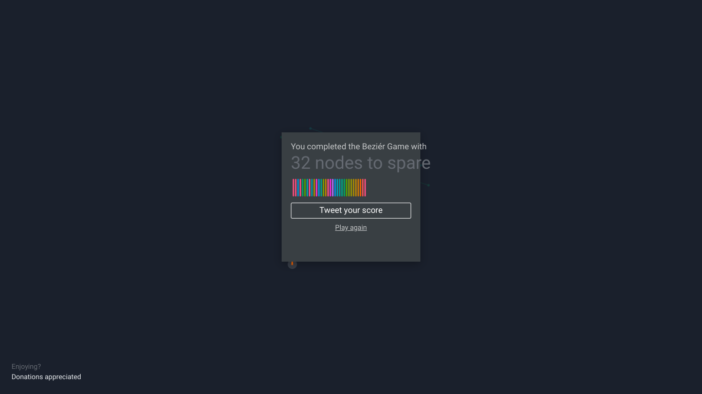 I ended this game with 32 nodes to spare, and I thought it was very helpful. Before this game, I had very little with the pen tool, and it was always a struggle to use. The game taught me the very basics of the tool and then gave a series of 14 (?) images to complete with the least amount of nodes possible; once the image was completed, the game would tell you the ideal solution of nodes and asked if you would like to try again. I finished the game, but it took a while because the website did not save my progress.
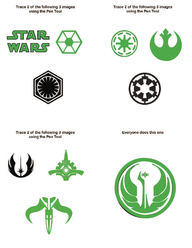 This helped improve my skills with the pen tool by providing images that escalated in difficulty as they continued. The one I had the most difficulty with was the final large one, as I could not get the circle to fit right despite re-doing it at least 5 times. The easiest one was the image that looks like two golf clubs with flags and it was a lot of fun to work on. I think this assignment was helpful and did a good job familiarizing me with the pen tool through the use of tracing complex images.
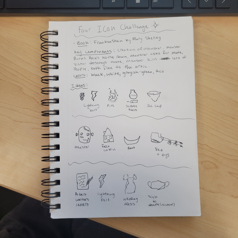 This activity helped me to break apart a plot and try an break it into 4ths. although I did not put this into Illustrator, I can see how the creation of shapes and different objects into icons could be helpful in adding to skills involving the program. The creation of multiple sets of icons was helpful, because I could then pick and choose the ones from each set I liked the most. If I were to officially do this challenge, I would use the first set of ideas, but replace the science tools with the wedding dress to symbolize the monsters threat to "be with [them] on their wedding night" and also to cover the death of Elizabeth in the plot. I could add blood splotches to the dress to further convey the point.
 While working with this font, I learned about its creation and what it is standardly used for. Typically this font is used for display or at small sizes rather than as a primary body text. The font was developed by the Monotype Corporation and released to the public in 1934. I chose this font because I liked the way it looked in the sample and thought it was fun to look at. If I were to use this font in the future I would stray away from using it as a body text, but I think it would look good as a poster font.
 For my first experience with illustrator, we were instructed to make a pizza. Illustrator differs from Photoshop because it is much more focused on creating 2d art without using pre-existing photographs. I like the way Illustrator works more than Photoshop, I think it is fun and exciting to use. as well as it is my preferred form of art. I could see this being used if I needed to make a poster or card for personal usages.
|
Disclaimer StatementThe views and opinions expressed in this blog are solely those of the author and do not represent those of Chapel Hill HS or Chapel Hill-Carrboro City Schools CategoriesArchives
April 2024
|
 RSS Feed
